Dropdown Hover
The w3-dropdown-hover class defines an hoverable dropdown element.
The w3-dropdown-content class defines the dropdown part to be displayed.
<div class="w3-dropdown-hover">
<button class="w3-btn w3-red">Hover Me!</button>
<div class="w3-dropdown-content w3-border">
<a href="#">Link 1</a>
<a href="#">Link 2</a>
<a href="#">Link 3</a>
</div>
</div>
<button class="w3-btn w3-red">Hover Me!</button>
<div class="w3-dropdown-content w3-border">
<a href="#">Link 1</a>
<a href="#">Link 2</a>
<a href="#">Link 3</a>
</div>
</div>

Menu Dropdown
The w3-dropdown-hover class is perfect for dropdown navigation menus.
You will learn more about navigation bars in a later chapter.

<!DOCTYPE html>
<html>
<meta name="viewport" content="width=device-width, initial-scale=1">
<link rel="stylesheet" href="http://www.w3schools.com/lib/w3.css">
<link rel="stylesheet" href="http://cdnjs.cloudflare.com/ajax/libs/font-awesome/4.6.3/css/font-awesome.min.css">
<body class="w3-container">
<h2>Navigation Bar with Dropdown</h2>
<p>Add a dropdown menu inside the navigation bar:</p>
<ul class="w3-navbar w3-card-2 w3-light-grey">
<li><a href="#">Home</a></li>
<li><a href="#">Link 1</a></li>
<li class="w3-dropdown-hover">
<a href="#">Dropdown <i class="fa fa-caret-down"></i></a>
<div class="w3-dropdown-content w3-white w3-card-4">
<a href="#">Link 1</a>
<a href="#">Link 2</a>
<a href="#">Link 3</a>
</div>
</li>
</ul>
<p>Tip: You will learn more about navigation bars in a later chapter.</p>
</body>
</html>
===================================================================
Clickable Dropdown
The w3-dropdown-click class is similar to w3-dropdown-hover, except that the dropdown is opened by JavaScript.

<!DOCTYPE html>
<html>
<meta name="viewport" content="width=device-width, initial-scale=1">
<link rel="stylesheet" href="http://www.w3schools.com/lib/w3.css">
<body class="w3-container">
<h2>Clickable Dropdown</h2>
<p>Click on the button to open the dropdown menu.</p>
<div class="w3-dropdown-click">
<button onclick="myFunction()" class="w3-btn">Button</button>
<div id="Demo" class="w3-dropdown-content w3-card-4">
<a href="#">Link 1</a>
<a href="#">Link 2</a>
<a href="#">Link 3</a>
</div>
</div>
<script>
function myFunction() {
var x = document.getElementById("Demo");
if (x.className.indexOf("w3-show") == -1) {
x.className += " w3-show"; // 加入 w3-show 的 class css.
// 讓menu 秀出來
} else {
x.className = x.className.replace(" w3-show", "");
}
}
</script>
=================================================================
Image Dropdowns
Move the mouse over the image: 使用w3-dropdown-hover
<div class="w3-dropdown-hover"><img src="img_fjords.jpg" alt="Monterosso" style="width:20%"> // 先把width 設成20% ...等於是縮圖
<div class="w3-dropdown-con tent" style="width:300px"><br>
<img src="img_fjords.jpg" alt="Norway" style="width:100%"> // 100%
<a href="#" class="w3-border">Visit Norway »</a>
</div>
</div>

======================================================================
Card Dropdowns
Move the mouse over one of the cities below:
London
Tokyo
當你滑鼠移到London 時.... 會跑出下面的圖

<h2>Card Dropdowns</h2>
<p>Move the mouse over "London":</p>
<div class="w3-dropdown-hover">London
<div class="w3-dropdown-content w3-card-4" style="width:250px">
<img src="img_london.jpg" alt="London" style="width:100%">
<div class="w3-container">
<p>London is the capital city of England.</p>
<p>It is the most populous city in the UK.</p>
</div>
</div>
</div>
Tokyo Paris
Progress Bar Labels
Add a new element inside the "w3-progressbar" to add a label to the progress bar.
Tip: Use the w3-center class to always keep the label centered. If omitted, it will be left aligned.
<div class="w3-progress-container">
<div id="myBar" class="w3-progressbar w3-green" style="width:25%">
<div class="w3-center w3-text-white">25%</div>
</div>
</div><br>
<div class="w3-progress-container">
<div id="myBar" class="w3-progressbar w3-red" style="width:50%">
<div class="w3-center w3-text-white">50%</div>
</div>
</div><br>
<div class="w3-progress-container w3-light-blue">
<div id="myBar" class="w3-progressbar w3-blue" style="width:75%">
<div class="w3-center w3-text-white">75%</div>
</div>
</div>
Dynamic Progress Bar
Use JavaScript to create a dynamic progress bar:
<h2>Dynamic Progress Bar</h2>
<div class="w3-progress-container">
<div id="myBar" class="w3-progressbar w3-green" style="width:1%"></div>
</div>
<br>
<button class="w3-btn w3-dark-grey" onclick="move()">Click Me</button>
<script>
function move() {
var elem = document.getElementById("myBar");
var width = 1;
var id = setInterval(frame, 10);
function frame() {
if (width >= 100) {
clearInterval(id);
} else {
width++;
elem.style.width = width + '%';
}
}
}
</script>
<div class="w3-progress-container">
<div id="myBar" class="w3-progressbar w3-green" style="width:20%">
<div id="demo" class="w3-center w3-text-white">20%</div>
</div>
</div>
<br>
Dynamic Progress Bar with Labels
<button class="w3-btn w3-dark-grey" onclick="move()">Click Me</button>
<script>
function move() {
var elem = document.getElementById("myBar");
var width = 20;
var id = setInterval(frame, 10);
function frame() {
if (width >= 100) {
clearInterval(id);
} else {
width++;
elem.style.width = width + '%';
document.getElementById("demo").innerHTML = width * 1 + '%';
}
}
}
</script>
===========================================================

<div class="w3-progress-container">
<div id="myBar" class="w3-progressbar w3-green" style="width:0%">
</div>
</div>
<p id="myP">Added <span id="demo">0</span> of 10 photos</p>
<button class="w3-btn w3-dark-grey" onclick="move();this.disabled='true'">Upload Photos</button>
<script>
function move() {
var elem = document.getElementById("myBar");
var width = 0;
var id = setInterval(frame, 50);
function frame() {
if (width >= 100) {
clearInterval(id);
document.getElementById("myP").className = "w3-text-green w3-animate-opacity";
document.getElementById("myP").innerHTML = "Successfully uploaded 10 photos!";
} else {
width++;
elem.style.width = width + '%';
var num = width * 1 / 10;
num = num.toFixed(0)
document.getElementById("demo").innerHTML = num;
}
}
}
</script>
==========================================================
// 把 id = modal01 的display 的屬性設成 block 就好
<img src="img_fjords.jpg" onclick="document.getElementById('modal01').style.display='block'"class="w3-hover-opacity">
// 預設是none ...所以不會顯現出來
<div id="modal01" class="w3-modal w3-animate-zoom" onclick="this.style.display='none'">
<img class="w3-modal-content" src="img_fjords.jpg">
</div>
// 預設是none ...所以不會顯現出來
<div id="modal01" class="w3-modal w3-animate-zoom" onclick="this.style.display='none'">
<img class="w3-modal-content" src="img_fjords.jpg">
</div>
===============================================================
Modal Image Gallery
Click on an image to display it in full size:
<div class="w3-row-padding">
<div class="w3-container w3-third">
<img src="img_fjords.jpg" style="width:100%" onclick="onClick(this)">
</div>
<div class="w3-container w3-third">
<img src="img_lights.jpg" style="width:100%" onclick="onClick(this)">
</div>
<div class="w3-container w3-third">
<img src="img_mountains.jpg" style="width:100%" onclick="onClick(this)">
</div>
</div>
<div id="modal01" class="w3-modal" onclick="this.style.display='none'">
<img class="w3-modal-content" id="img01" style="width:100%">
</div>
// src 在 script 裡面設定
<script>
<div class="w3-container w3-third">
<img src="img_fjords.jpg" style="width:100%" onclick="onClick(this)">
</div>
<div class="w3-container w3-third">
<img src="img_lights.jpg" style="width:100%" onclick="onClick(this)">
</div>
<div class="w3-container w3-third">
<img src="img_mountains.jpg" style="width:100%" onclick="onClick(this)">
</div>
</div>
<div id="modal01" class="w3-modal" onclick="this.style.display='none'">
<img class="w3-modal-content" id="img01" style="width:100%">
</div>
// src 在 script 裡面設定
<script>
function onClick(element) {
document.getElementById("img01").src = element.src;
document.getElementById("modal01").style.display = "block";
}</script>
document.getElementById("img01").src = element.src;
document.getElementById("modal01").style.display = "block";
}</script>
Closing Alerts
To close these containers, click on the X in the upper right corner:
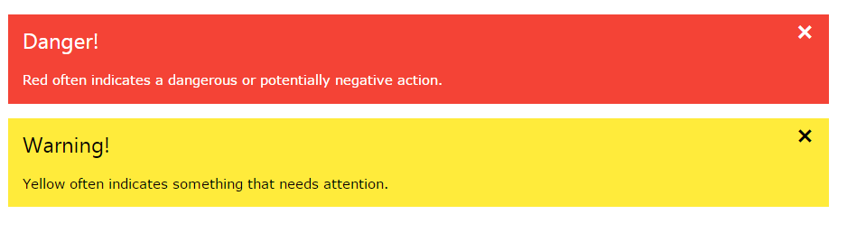
<span onclick="this.parentElement.style.display='none'" class="w3-closebtn">×</span>
× is an HTML entity that is the preferred icon for close buttons, rather than the letter "x".
沒有留言:
張貼留言